Who made an impact on you?
Voting Has Ended
Winner : Nurse 1
Nurse 1
Votes: 0
Nurse 2
Votes: 0
Nurse 3
Votes: 0
Nurse 4
Votes: 0
Vote for the Best History Poster
Voting Has Ended
Winner : Harry W. Martin, The Urologist Who Treated Hollywood
Harry W. Martin, The Urologist Who Treated Hollywood
Votes: 0
Arnold M. Belker: Modern Vasectomy Reversal and Microsurgical Training
Votes: 0
Henry Bugbee's Eponymous Electrode
Votes: 0
Forked Tongue Crusher of Stone
Votes: 0
Leonard Paul Wershub, MD and History of Urology
Votes: 0
The Man Behind the Maneuver: Robert J. Prentiss MD
Votes: 0
Oswald S. Lowsley, MD: Pioneer in Prostate Anatomy & Surgical Technique
Votes: 0
Prostate Cancer, William H. Welch and Urology
Votes: 0
The Evolution of Bladder Rupture Management
Votes: 0
E. Darracott Vaughan, MD: Bridging Science and Surgery
Votes: 0
Manufacturing Andropause
Votes: 0
Ormond's Disease and the Urologists
Votes: 0
Fidelis Udeh: Expanding the Legacy of Black Urologists
Votes: 0
The Emergence of Labiaplasty in Urology
Votes: 0
next game?
Voting Has Ended
Winner : transistor
transistor
Votes: 1
dredge
Votes: 1
ace attorney
Votes: 0
caravan sandwitch
Votes: 0
slay the princess
Votes: 0
signalis
Votes: 0
small saga
Votes: 0
pilgrims
Votes: 0
next game?
Voting Has Ended
Winner : transistor
transistor
Votes: 0
Votes: 0
Gender Coordinator Election
Voting Has Ended
Winner : Abebaye Asrat
Abebaye Asrat
Votes: 1
Bethlehem Tekeste
Votes: 0
Bisrat Fikadu
Votes: 0
Gebrelwa Tamene
Votes: 0
May books
Voting Has Ended
Winner : No more tears: the dark secrets of Johnson and Johnson by Gardiner Harris
No more tears: the dark secrets of Johnson and Johnson by Gardiner Harris
Votes: 0
This is going to hurt: secret diaries from a junior doctor by Adam Kay
Votes: 0
Bunk: the rise of hoaxes, humbug, plagiarists, phonies, post-facts, and fake news by Kevin Young
Votes: 0
Consejo 2026
Voting Has Ended
Winner : Erica Paola

David Flecha
Votes: 0

Erica Paola
Votes: 1
witch is faster, jogging or running?
Voting Has Ended
Winner : running! run!
jogging! jog!
Votes: 0
running! run!
Votes: 1
witch is faster, jogging or running?
Voting Has Ended
Winner : jogging! jog!
jogging! jog!
Votes: 0
running! run!
Votes: 0
Continuing Education 2026 - August 1st & 2nd
Voting Has Ended
Winner : I would prefer to attend both classes Saturday & Sunday (UE/LE)
I would prefer to attend both classes Saturday & Sunday (UE/LE)
Votes: 0
I would prefer to attend only Saturday course (UE)
Votes: 0
I would prefer to attend only Sunday course (LE)
Votes: 0
Monster Mash
Voting Has Ended
Winner : buttercup

fern fiddlehead
Votes: 0

trillium
Votes: 0

buttercup
Votes: 1

thistle
Votes: 0

iris
Votes: 0

snapper
Votes: 0
Régiós találkozó időpontja
Voting Has Ended
Winner : Április 10. (péntek) 17:00
Április 9. (csütörtök) 17:00
Votes: 0
Április 10. (péntek) 17:00
Votes: 1
Április 11. (szombat) 17:00
Votes: 0
Voiture
Voting Has Ended
Winner : Vklas
Vito
Votes: 0
Vklas
Votes: 1
Sprinter
Votes: 0
What is the best Harry Potter book?
Voting Has Ended
Winner : The philosiphers stone
The philosiphers stone
Votes: 1
The Chamber of Secerates
Votes: 0
The Prisoner of Azkaban
Votes: 0
The Goblet of Fire
Votes: 1
The Order of the Pheonix
Votes: 0
The Half Blood Prince
Votes: 0
The Deathly Hollows
Votes: 0
Bình chọn
Voting Has Ended
Winner : Đội 1
Đội 1
Votes: 1
Đội 2
Votes: 0
Đội 3
Votes: 0
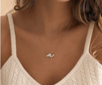
Bijoux Mariage
Voting Has Ended
Winner : Boucles oreilles 1

Boucles oreilles 1
Votes: 1

Boucles oreilles 2
Votes: 0

Boucles oreilles 3
Votes: 0

Boucles oreilles 4
Votes: 0

Collier 1
Votes: 0

Collier 2
Votes: 0
Bijoux Mariage
Voting Has Ended
Winner : Boucles oreilles 1

Boucles oreilles 1
Votes: 0

Boucles oreilles 2
Votes: 0

Boucles oreilles 3
Votes: 0

Boucles oreilles 4
Votes: 0
Collier 1
Votes: 0

Collier 2
Votes: 0
CareBear Mandatory Meeting, 60 minutes (choose all that apply)
Voting Has Ended
Winner : Wed, 3/25 @ 6:30pm
Wed, 3/25 @ 6:30pm
Votes: 3
Wed, 3/25 @ 7:30pm
Votes: 3
Thu, 3/26 @ 6:30pm
Votes: 0
Thu 3/26 @ 7:30pm
Votes: 0
None of these dates/times work for me. DM Poppins
Votes: 1
prom queen
Voting Has Ended
Winner : ws

jiajia
Votes: 0

ws
Votes: 3

yz
Votes: 1
Audiobook Cover-Abstimmung
Voting Has Ended
Winner : Cover A (hell)
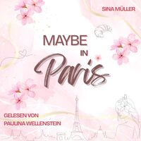
Cover A (hell)
Votes: 1

Cover B (dunkler)
Votes: 0
Kiểm
Voting Has Ended
Winner : Số 1
Số 1
Votes: 1
Số 2
Votes: 0
Số 3
Votes: 0
Số 4
Votes: 0
Số 5
Votes: 0
מה הייתם מעדיפים
Voting Has Ended
Winner : יום שלם של הרצאות
יום שלם של הרצאות
Votes: 0
יום שלם של עע
Votes: 0
מה הייתם מעדיפים
Voting Has Ended
Winner : יום שלם של הרצאות
יום שלם של הרצאות
Votes: 0
יום שלם של עע
Votes: 0
Feliks Zakirov Annual Evaluation
Voting Has Ended
Winner :
Votes: 0
Votes: 0